Case study
Takamoa The animated signature of our own brand
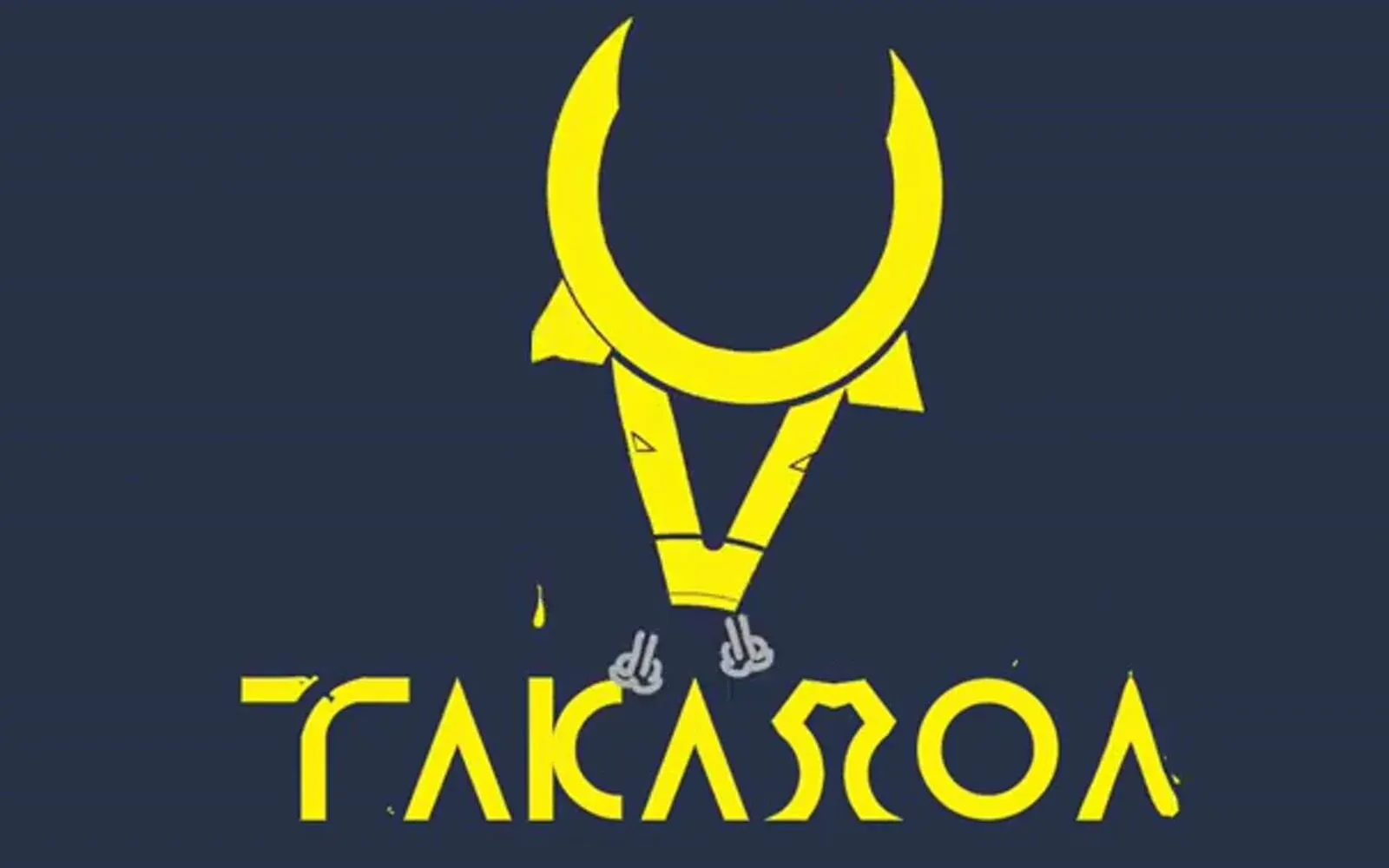
An agency that sells logo animation is judged first on its own. We turned the Takamoa brand into a fluid signature, short enough and quiet enough to close a video without ever stealing the scene from what came before it.
The context
In-house project: the client is us. This signature of a few seconds is not our fifteen-second reel, which has its own page: it closes videos, the reel introduces the agency.
An agency that sells logo animation sooner or later runs into the question nobody asks out loud: and yours? It is a reasonable objection. A studio that shows twenty animated brands and leaves its own sitting still says a great deal, without meaning to, about what it thinks of the exercise.
So we needed a visual signature — not a film, not a technical demonstration: the handful of seconds that opens or closes a video, a presentation, a social clip, and says where it came from.
What we produced
A fluid animation of the Takamoa logo, conceived as part of a system rather than as a standalone piece.
The real problem: not taking up too much room
The classic mistake with an agency signature is doing it too well. An ambitious animation at the end of a video competes with the message it has just served: the viewer remembers the logo’s performance and forgets the film. It then works against whoever paid for it — and when whoever paid for it is the agency, it works against the agency’s credibility.
The constraint was therefore to be simple and memorable at once: present enough to stick, discreet enough to crush nothing.
Movement rather than effect
We worked in soft transitions and continuous movement, turning the fixed form of the logo into an animated one — no hard cuts, no bounce, no dated stylistic flourish that would age the brand in two years. Fluidity is not a decorative choice: it is what we wanted to say about how the agency works.
The colours and the shapes stay those of the brand, with nothing added for the occasion.
A signature, therefore adaptable
The animation was calibrated to hold on every medium where it was going to be used: end of video, presentation, advertising material, vertical format as well as horizontal. A signature that exists in one format only is not a signature — it is a shot.
What it changes
A brand identity stops being a document the day it moves. The Takamoa logo is no longer only a shape set at the top of a page: it is a few recognisable seconds, reusable as they are, that close every production we deliver.
And incidentally, this page answers the objection that brought it into being. The work we propose to brands, we apply to ourselves — with the same constraints, and the same refusal to overdo it.
The film
The film, as delivered
Play the video: Takamoa — animated signature More work
Also worth a look
Cité des Cultures
Cité des Cultures – An identity that holds from one show to the next
A cultural centre whose programme changes every month needed one thing that doesn't. We built its identity — a logo, a four-colour palette and a motion sequence — so the place stays recognisable from one exhibition to the next.
Jeune Patronat de Madagascar
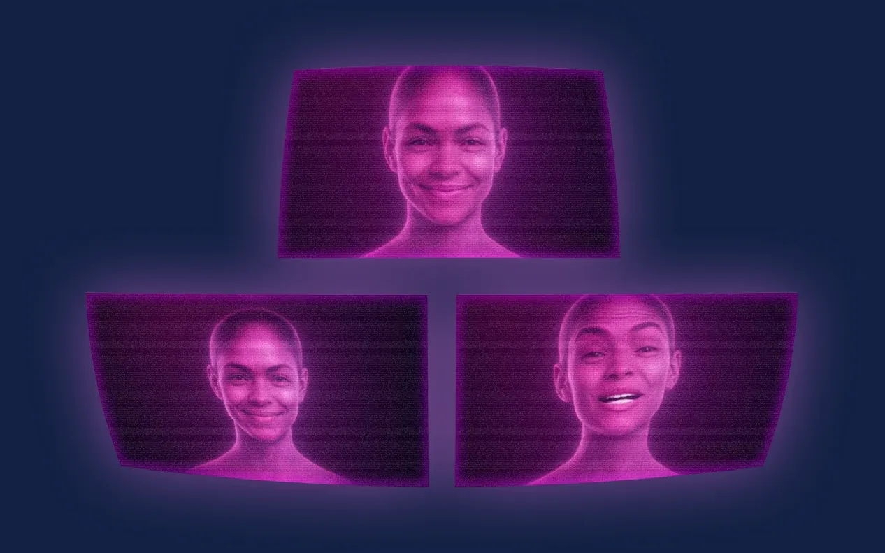
Jeune Patronat de Madagascar – Making a first edition feel like a fixture
The Jeune Patronat de Madagascar was launching its first major entrepreneurs' gathering. In three months Takamoa built the whole thing — identity, content, video, landing page, campaigns — and handed the stage to a host created with artificial intelligence.
Tinkera
Tinkera – An identity for electronics taught in Malagasy
Learning electronics should depend neither on the language you speak nor on the budget you have. We gave Tinkera the identity of that conviction: a logo worked for every medium, a palette, typographic rules, and then the animation that sets it in motion.