Case study
Tinkera An identity for electronics taught in Malagasy
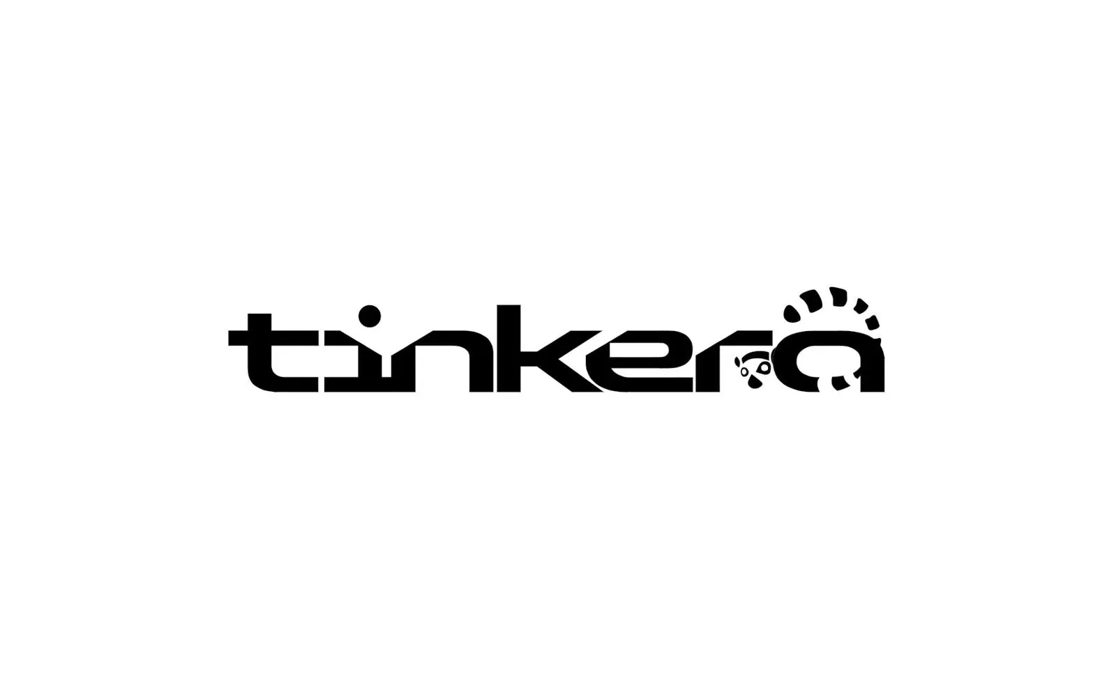
Learning electronics should depend neither on the language you speak nor on the budget you have. We gave Tinkera the identity of that conviction: a logo worked for every medium, a palette, typographic rules, and then the animation that sets it in motion.
The context
Tinkera teaches electronics in Madagascar, and does it in a language electronics tutorials almost never use: Malagasy.
That is the starting point, and it explains everything else. A student, a teacher or a tinkerer who wants to build a first circuit runs into three walls in a row: the content is in English or French, the components cannot be found locally, and the prices discourage you before you even try. Tinkera attacks all three — tutorials, code and wiring diagrams explained in Malagasy; a community where people publish their projects and answer one another’s questions; and a shop that delivers Arduino boards, ESP32s, sensors and modules across the country.
The brand had grown. It needed an identity that would hold on a screen, on a bag of components and on a workshop banner alike — without ever coming across as a closed club.
What we produced
A complete identity, and then its motion.
A logo built as a signature, not as a picture
The logo was designed minimal and modern, and delivered from the outset in several official versions — primary in positive and negative, monochrome for technical uses, and simplified icons for social media and small formats.
That is not guideline luxury. A brand that lives on component labels, tutorial thumbnails and community avatars is seen nine times out of ten very small, in a single colour, or on a background nobody chose. A logo that only exists in its full colour version is a logo that disappears under the real conditions of its use.
A palette that holds both promises
The colours had to say two things at once — technical and accessible — which contradict each other easily. The palette distributes them: soft sky blue for trust, pearl grey for balance, vivid indigo for innovation, deep navy for reliability, and a dark violet that gives the whole its distinctive character.
Two typefaces, and rules to hold them
Genhead Futuristic carries headings and slogans, and owns the digital, forward-leaning register. Blair ITC takes the body text, where only elegance and legibility count. Strict usage rules complete the guidelines, so the identity does not degrade as it is picked up by other hands — which, in an open community, is bound to happen.
The logo animation
The logo was then animated as a short sequence of five to ten seconds, approved on animatic before final delivery. The constraint was the one common to any animation working under guidelines: translating Tinkera’s technical DNA into fluid movement, with no distortion, no visual overload and no colour shift. A discreet sound design and video overlays complete the sequence so it drops cleanly into any production.
What it changes
Tinkera now has an identity that structures everything it puts out — the site, the shop, the teaching materials, the events — and an animated signature for video formats.
For a brand whose whole bet is making the technical accessible, visual consistency is not an aesthetic comfort: it is what makes a website, a workshop and a bag of components recognisable as the same house, by people who are discovering the field at the same time as the brand.
The film
The film, as delivered
Play the video: Tinkera — logo animation More work
Also worth a look
Cité des Cultures
Cité des Cultures – An identity that holds from one show to the next
A cultural centre whose programme changes every month needed one thing that doesn't. We built its identity — a logo, a four-colour palette and a motion sequence — so the place stays recognisable from one exhibition to the next.
Jeune Patronat de Madagascar
Jeune Patronat de Madagascar – Making a first edition feel like a fixture
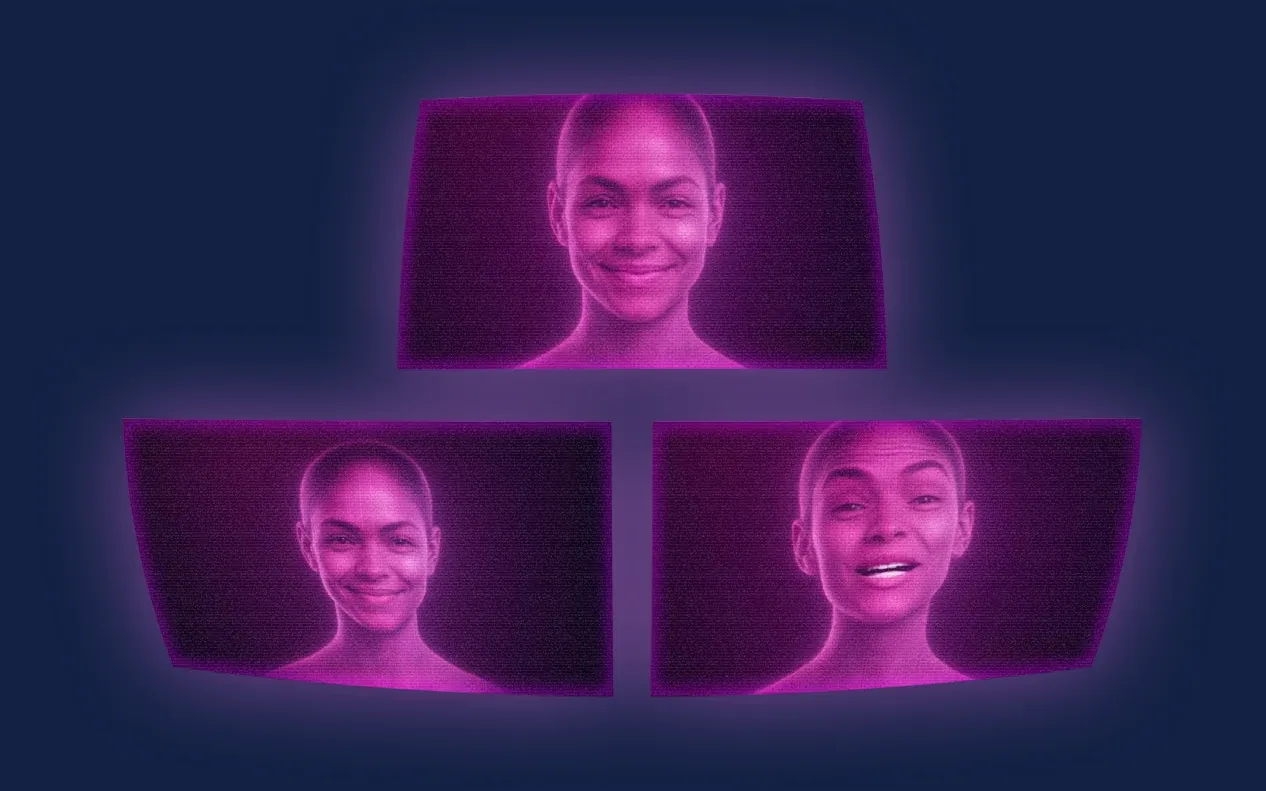
The Jeune Patronat de Madagascar was launching its first major entrepreneurs' gathering. In three months Takamoa built the whole thing — identity, content, video, landing page, campaigns — and handed the stage to a host created with artificial intelligence.
ASA
ASA – A digital campaign for an international school
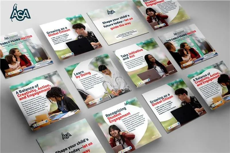
The American School of Antananarivo (ASA), known for an educational offer aligned with International Baccalaureate standards, asked Takamoa to build a full-scale digital campaign.