Case study
Cité des Cultures An identity that holds from one show to the next
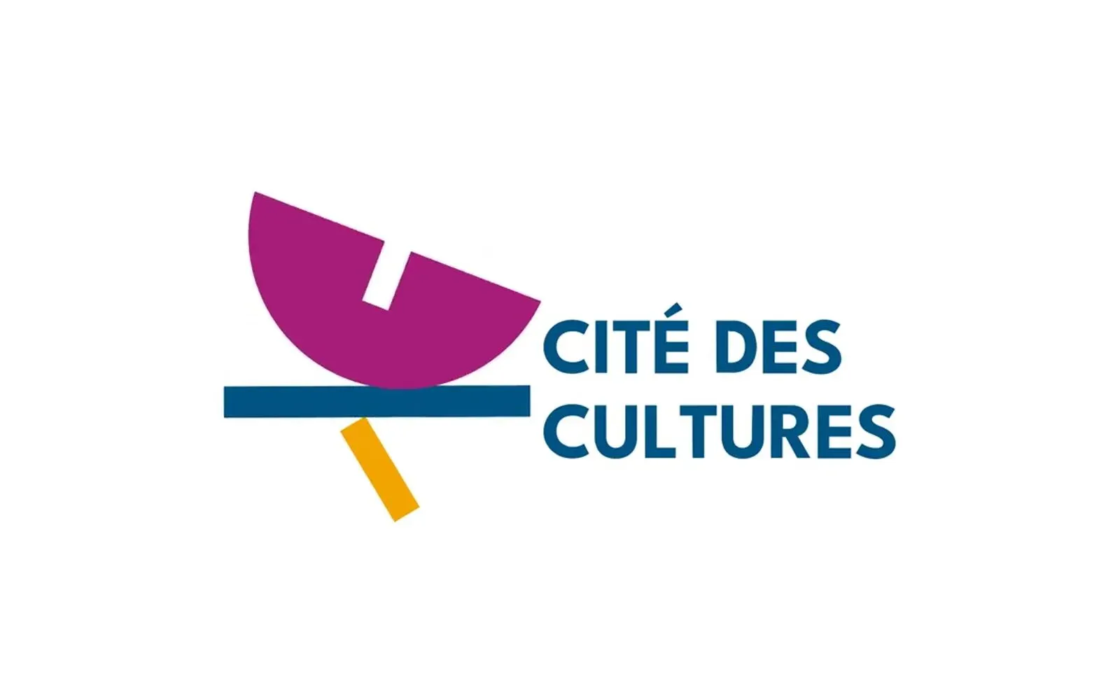
A cultural centre whose programme changes every month needed one thing that doesn't. We built its identity — a logo, a four-colour palette and a motion sequence — so the place stays recognisable from one exhibition to the next.
The context
The Cité des Cultures occupies the former headquarters of the Bank of Africa Madagascar, at 2 place de l’Indépendance, in the heart of Antaninarenina. The building was converted and the venue opened in May 2024, with backing from the bank’s foundation.
It is not a gallery. It is eight rooms bearing Malagasy names — Makay, Tsingy, Anakao, Diantsoa, Tiakolo, Arindra, Ikaloina, Arykanto — and as many uses: a 200 m² conference room, a multi-purpose space with a gallery and a balcony, a digital room fitted with computers, an acoustic music room, an art room with its own sink.
Hence the difficulty. A venue whose programme changes every month — a photography show in June, craft in December, piano lessons on Wednesdays, a festival in August — risks changing its appearance every month along with it. It needed something that does not move, and that stays recognisable without imposing a single tone on disciplines that share none.
What we produced
A logo
A distinctive mark, made to work both as a headline and tucked into the corner of a programme.
A four-colour palette
Magenta, blue, orange, green. Four, and that is the central gesture of the identity: a single colour would have forced the brand to arbitrate between music, image, writing and digital — to decide which of the four is the venue’s real colour. Four colours give each register its own, without any of them falling outside the identity.
That is what lets a concert poster and an exhibition poster look nothing alike while visibly coming from the same place.
A motion sequence, which tells the story of a handover
A living venue cannot be introduced entirely in a still image. The animation gives the identity its movement, for the moments where the logo has to appear, settle, and then get out of the way of the content.
But it does more than move, and that is the real subject of the eight seconds below: it opens on the BANK OF AFRICA logo — the green square — and lets it come apart so that the shapes of the Cité des Cultures can assemble in its place. The magenta half-disc, the blue bar, the yellow bar arrive one by one, and then the name settles.
That is not a transition effect. It is the statement of the project: a bank installs a cultural venue in its former headquarters and hands over to it. The film says so without a single sentence, and it says so in eight seconds.
The communication materials
The palette carries through into print, so the consistency holds on what is handed out in the building too.
What it changes
Two years after opening, the venue’s website still leads with the line the portfolio places under the logo: « De la Culture pour chacun, une richesse pour tous ! » The buttons on the home page are magenta and orange.
That is the only measure worth anything for an identity: not that people liked it, but that it is still there, and still used as it was drawn, by the people it belongs to.
The film
The film, as delivered
Play the video: Cité des Cultures — logo animation More work
Also worth a look
Jeune Patronat de Madagascar
Jeune Patronat de Madagascar – Making a first edition feel like a fixture
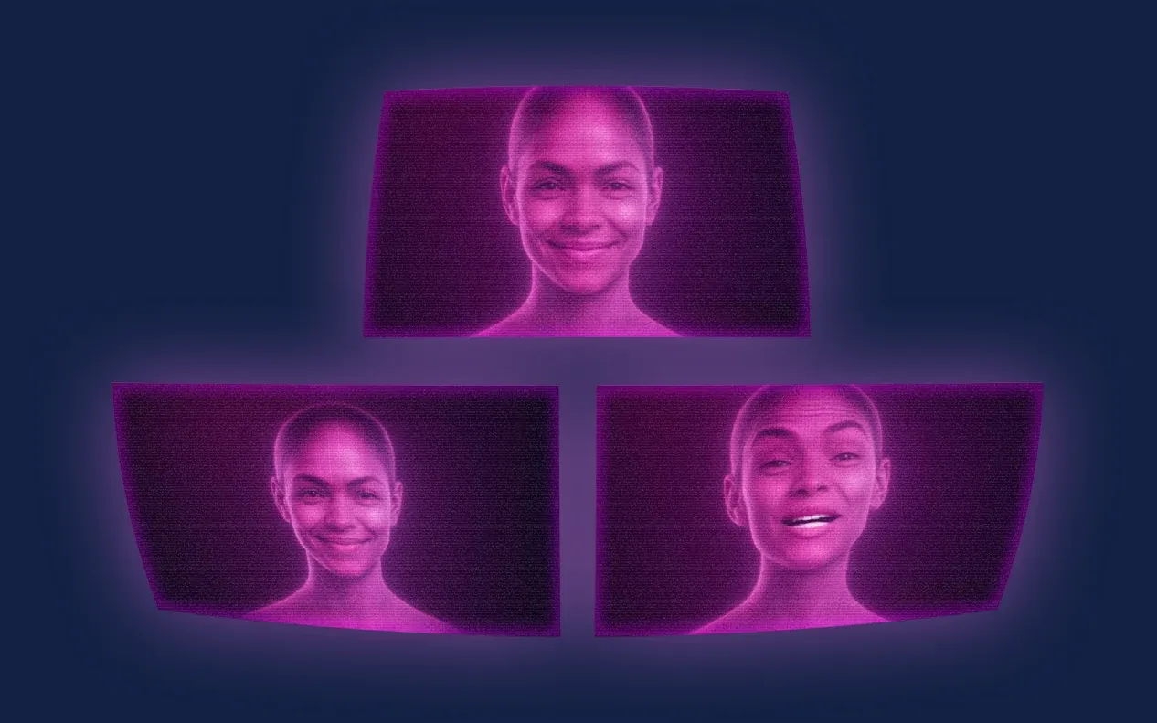
The Jeune Patronat de Madagascar was launching its first major entrepreneurs' gathering. In three months Takamoa built the whole thing — identity, content, video, landing page, campaigns — and handed the stage to a host created with artificial intelligence.
Tinkera
Tinkera – An identity for electronics taught in Malagasy
Learning electronics should depend neither on the language you speak nor on the budget you have. We gave Tinkera the identity of that conviction: a logo worked for every medium, a palette, typographic rules, and then the animation that sets it in motion.
ASA
ASA – A digital campaign for an international school
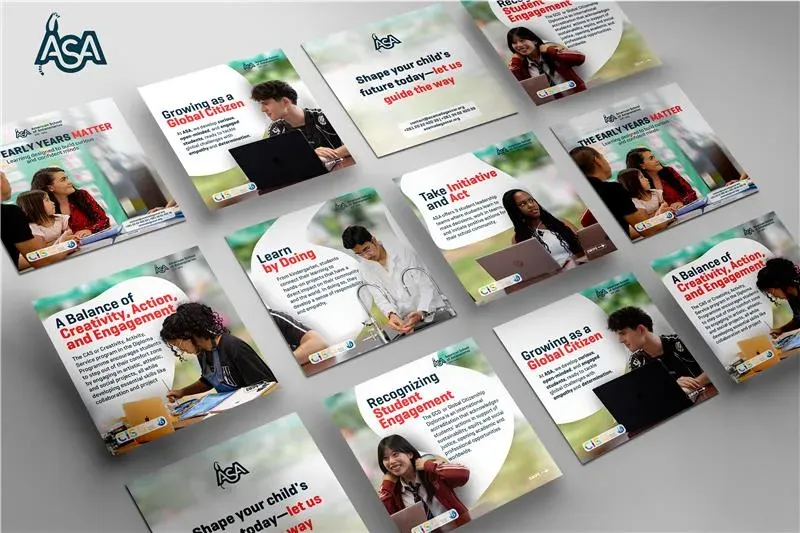
The American School of Antananarivo (ASA), known for an educational offer aligned with International Baccalaureate standards, asked Takamoa to build a full-scale digital campaign.