Case study
Anjaranay Giving in a handful of clicks
A charity rarely loses donors on conviction; it loses them on the procedure. We built the site that tells the Anjaranay story and puts online giving within a handful of clicks, secure payment included.

The context
Anjaranay is a training and health centre on the island of Sainte-Marie, born of an initiative by the Cétamada association and the Swiss association Solférino. It is a sustainable development project: people are trained there, people are treated there, and it is funded in part by donations.
A charity collecting online rarely loses donors on conviction. It loses them on the mechanics. Somebody moved by a cause who cannot find where to give, or who lands on a six-screen form, does not come back: the impulse is a passing state, and it does not survive friction.
So the site had to do two things at once, without setting them against each other: tell enough of the story to convince, and take the money without making anyone wait.
What we produced
A showcase site with a donation funnel built into it.
An identity that does not borrow the humanitarian register
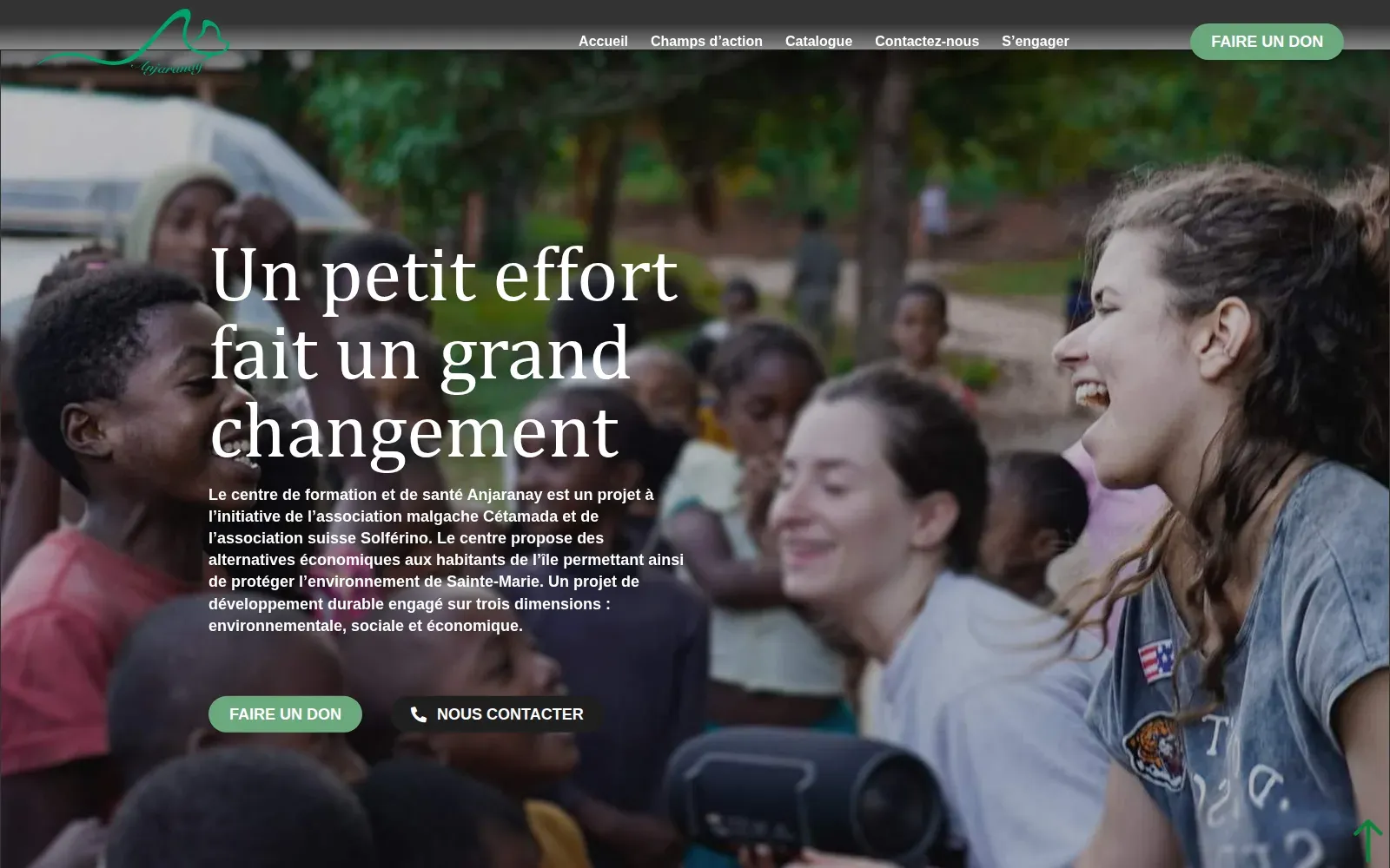
The design draws on Anjaranay’s values, mission and tone rather than on the sector’s visual codes. Colours, graphic elements, layout: every choice was made so the site looks like this particular project — not like a generic NGO.
Giving in a few clicks, secure payment included
The donation interface was designed to fit into one short gesture, with secure payment options built in. That is not a technical detail: on a donation page, perceived security is part of the conversion, and a donor who doubts the page abandons at the moment of typing their card number.
Content that gives reasons to give
The story, the goals and the achievements are presented as a continuous account — not as a list of arguments, but as something you can read from one end to the other. A charity that only explains its needs earns pity; a charity that shows what it has already done earns trust.
News, so the donation is not a full stop
A dedicated news and updates section lets people follow the initiatives under way. That is what separates a one-off donor from a supporter: the first has no idea what their money produced, the second sees it.
What it changes
The site does two jobs at once — shop window and till — without the second spoiling the first. A pure fundraising platform would have converted without convincing; a pure showcase would have convinced without collecting.
For an organisation living on the generosity of people it will never meet, that is the only arrangement that works: making the mission legible, and making the gesture easy, on the same page.
In pictures
How it looks
More work
Also worth a look
Hamac
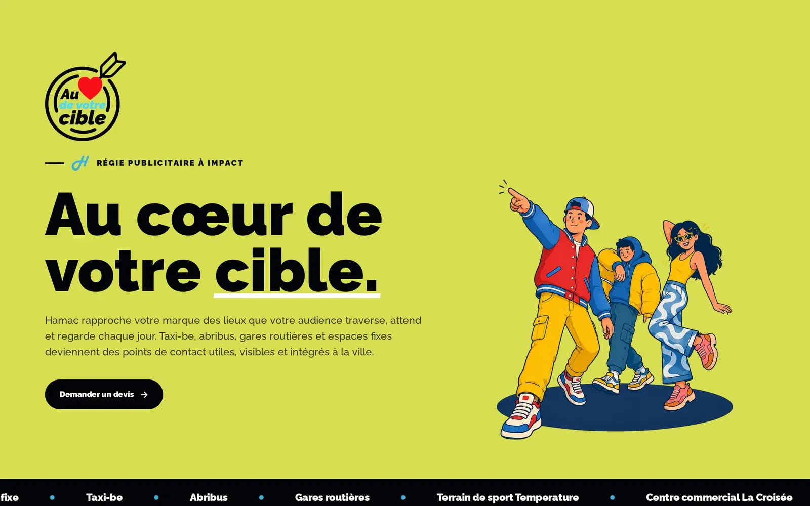
Hamac – Selling outdoor advertising to people who live online
An advertising broker whose inventory sits in places rather than on billboards. We built the site that collects already-qualified quote requests — then, month after month, the content that argues for outdoor advertising where the advertisers actually are: online.

Jeune Patronat de Madagascar
Jeune Patronat de Madagascar – Making a first edition feel like a fixture
The Jeune Patronat de Madagascar was launching its first major entrepreneurs' gathering. In three months Takamoa built the whole thing — identity, content, video, landing page, campaigns — and handed the stage to a host created with artificial intelligence.
Jeune Patronat de Madagascar
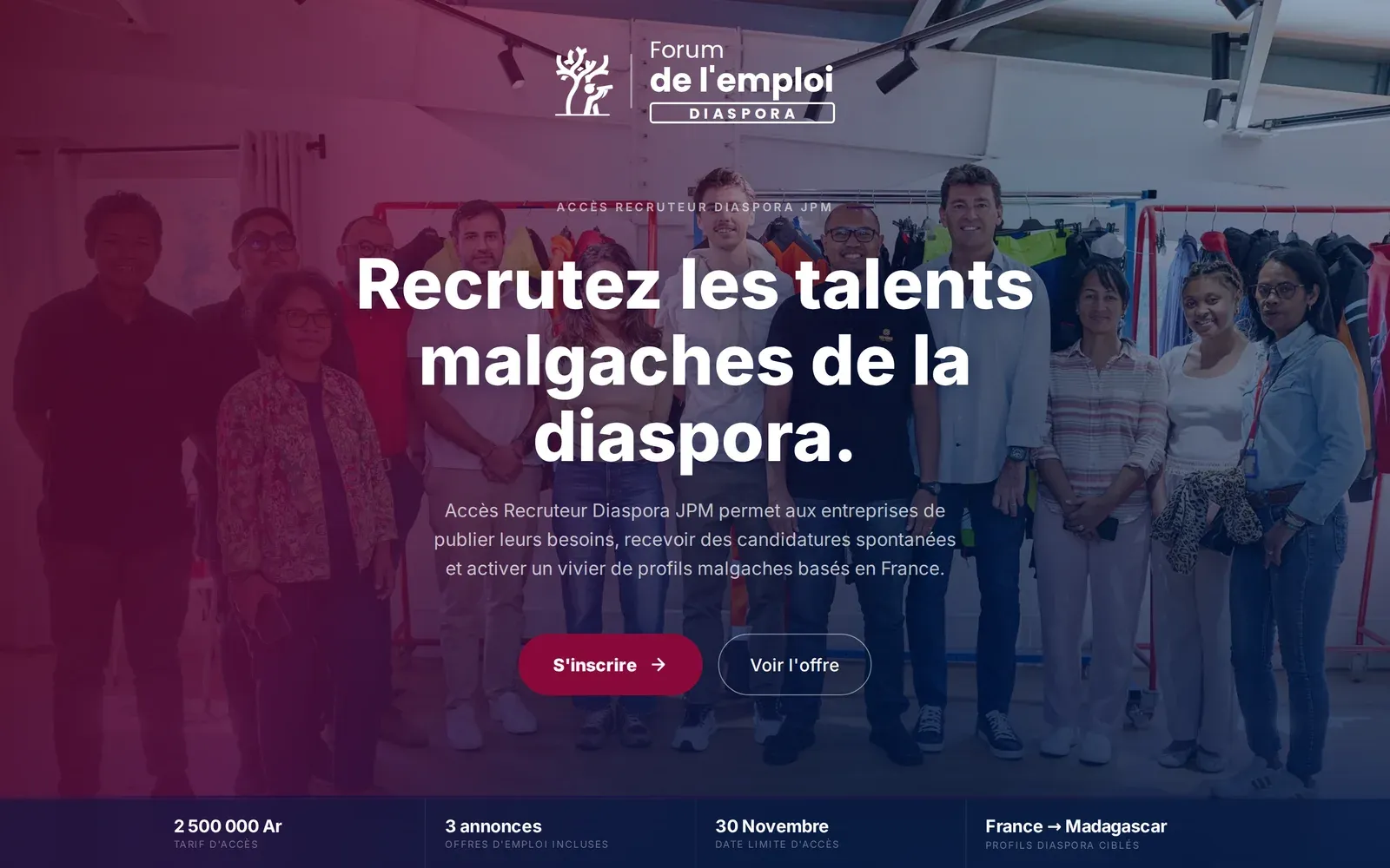
Jeune Patronat de Madagascar – Recruiting at the forum without flying to Paris
The Diaspora job forum brought Malagasy companies and diaspora talent together in Paris for a job-dating event. We built the platform that stretches those two days into five months, and opens them to the companies that could not make the trip.