Case study
Ormel The platform that trains, audits and recruits in QHSE
Three trades in a single platform: training, auditing and recruiting in quality, safety and environment. We designed the interface, developed the site with its member area and its certified course catalogue, then animated the mascot that gives it a face.
The context
Ormel works with quality, health, safety and environment professionals — QHSE, in companies large enough to give it a job title of its own.
It is a field where the pressure comes from outside: an ISO 9001 or ISO 14001 standard has to be prepared for, audited and renewed, and every deadline mobilises people who have no time to spend three days away on a course. Ormel had therefore built its offer around three activities that answer one another — training, auditing, recruiting — with courses designed to be taken online, freely available resources and one-to-one coaching.
Three trades under one roof do not fit into a brochure site. What was needed was a platform.
What we produced
Three assignments, a few months apart, that amount to one.
The design, before the code
The work began with the interface. We drew a complete design — palettes, typography, page templates — with one requirement that is simple to state and hard to meet: that the three activities coexist without the user having to understand Ormel’s org chart to find their way.
The approach stayed minimal, and responsive behaviour was handled in the design rather than patched in afterwards: a QHSE manager browses a course catalogue between two meetings, usually on a phone.
The platform
The site was then built around three components:
- a secure member area, giving access to reserved resources;
- a library of certified courses online, purchasable directly;
- a company area and a tool matching businesses with QHSE candidates.
The rest of the site — audit programmes by standard, articles, testimonials — was organised with filters and search, because a catalogue that grows without being filterable becomes a catalogue nobody opens.
The animated mascot
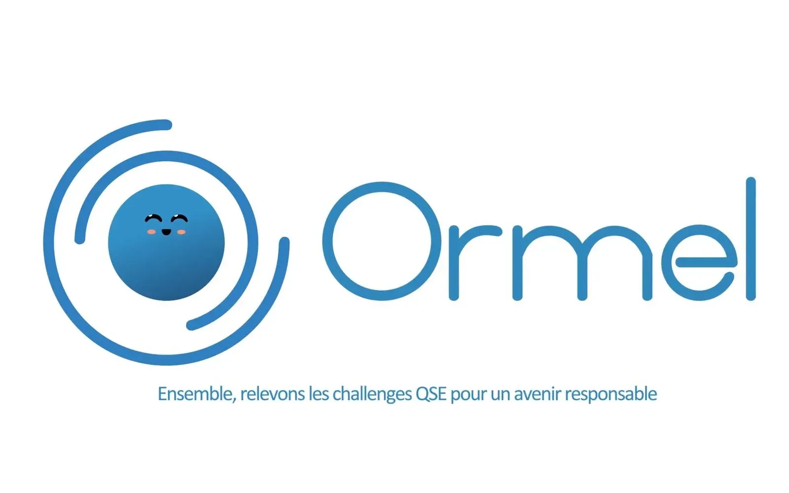
Ormel had a mascot, and a mascot that doubles as a logo. We animated it — which raises the same problem as any identity already fixed: giving it life without redrawing it.
The animation starts from a discreet beat, almost a breath, before the character moves into gestures that carry the brand’s tone. Each movement was chosen to express a quality Ormel claims — approachability, welcome — rather than for decoration. In a sector that talks about standards and compliance, the mascot carries all of the warmth.
What it changes
QHSE is an austere trade whose websites all look alike: regulatory text, standard logos, and a contact form. Ormel gave itself the opposite — a platform where you take a course, buy it, look for a job, and where a character greets you.
What we delivered is not three assignments side by side. It is one thing seen from three angles: the interface before the code, the code before the content, and a face over the top so the whole reads as welcoming rather than administrative.
The film
The film, as delivered
Play the video: Ormel — mascot animation More work
Also worth a look

Jeune Patronat de Madagascar
Jeune Patronat de Madagascar – Making a first edition feel like a fixture
The Jeune Patronat de Madagascar was launching its first major entrepreneurs' gathering. In three months Takamoa built the whole thing — identity, content, video, landing page, campaigns — and handed the stage to a host created with artificial intelligence.
Cité des Cultures
Cité des Cultures – An identity that holds from one show to the next
A cultural centre whose programme changes every month needed one thing that doesn't. We built its identity — a logo, a four-colour palette and a motion sequence — so the place stays recognisable from one exhibition to the next.
Jeune Patronat de Madagascar
Jeune Patronat de Madagascar – Recruiting at the forum without flying to Paris
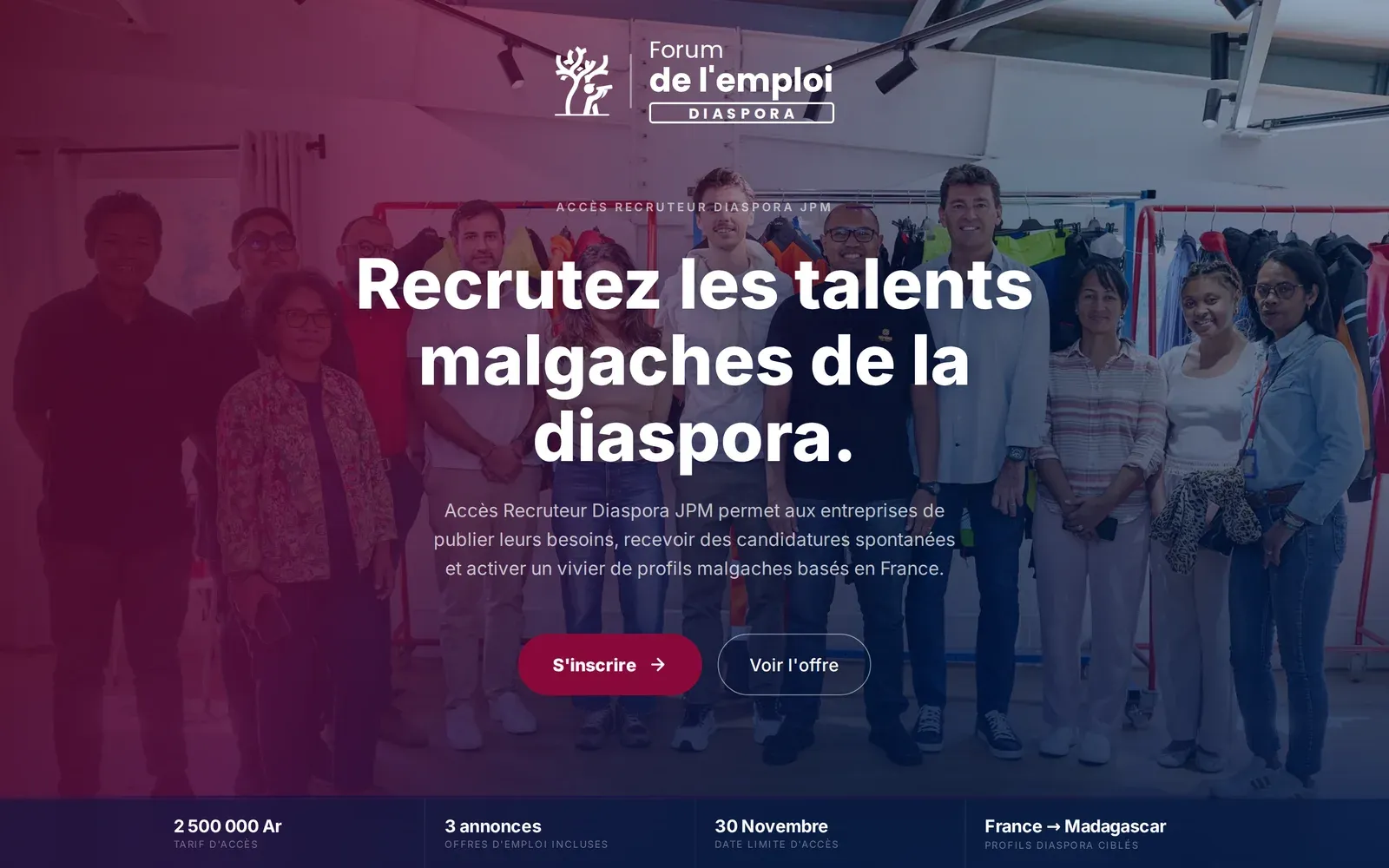
The Diaspora job forum brought Malagasy companies and diaspora talent together in Paris for a job-dating event. We built the platform that stretches those two days into five months, and opens them to the companies that could not make the trip.