Case study
Moon Trade Four pages that carry the argument
Most brochures fail because they are designed before anyone knows what they have to say. For Moon Trade, we wrote the argument and designed the layout together, across four pages.
The context
Moon Trade needed a sales brochure.
It is the most ordinary request in the trade, and the one most often missed — for a reason that has nothing to do with graphic design. In most cases the client supplies a text, the studio lays it out, and you end up with a well-composed document nobody reads past the second page.
The problem is not the layout: it is that the text was never written to be laid out. A sales argument has an order — what hooks, what reassures, what decides — and that order has to be the same as the order of the pages. When the two are designed separately, they contradict each other.
What we produced
A four-page brochure, designed and written together.
The argument first
We structured the argument before the layout: which benefits come first, which wait for the next page, what can be said in a heading and what needs a paragraph.
That is the invisible work of the project, and it decides everything else. A brochure whose hierarchy is right reads effortlessly; people then assume the design succeeded, when what succeeded is the order of the ideas.
Four pages, not six
The format constrains usefully. Four pages force you to decide what matters — and a prospect handed four pages goes through them, where they put down a twelve-page document.
A layout that serves the reading
Every visual element was made to carry the argument rather than accompany it: what has to be seen first is, and what has to reassure sits exactly where the doubt appears.
What it changes
Moon Trade has a piece a salesperson can put on a table without having to explain it — and that a prospect can take away and reread alone, which is the real test of a brochure.
It is also, often, the first thing a company shows of itself. A well-judged brochure does not sell on its own; a slapdash one creates doubt before the first argument.
More work
Also worth a look
Manohy
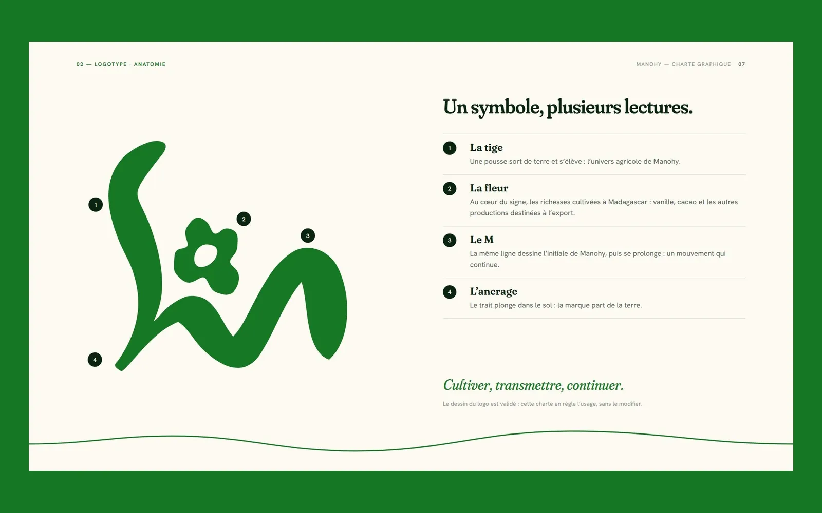
Manohy – A brand guide that ties the land to export
Manohy exports produce grown in Madagascar. We proposed its logo and, once it was approved, wrote the guidelines that govern its use, from the name all the way to the export sack: 36 pages, approved by the client.
Cité des Cultures
Cité des Cultures – An identity that holds from one show to the next
A cultural centre whose programme changes every month needed one thing that doesn't. We built its identity — a logo, a four-colour palette and a motion sequence — so the place stays recognisable from one exhibition to the next.
Immo Stand
Immo Stand – Reassuring before the first viewing
Choosing a furnished rental requires trust, often before a single viewing. We built a simple, structured identity, led by blue, so the agency's professionalism is visible from the first interaction.