Case study
Manohy A brand guide that ties the land to export
Manohy exports produce grown in Madagascar. We proposed its logo and, once it was approved, wrote the guidelines that govern its use, from the name all the way to the export sack: 36 pages, approved by the client.
The context
Manohy is a family business that exports produce grown in Madagascar: vanilla, cocoa, spices. We had first worked on its logo: proposals, then the design the client approved. What was missing next was the rulebook: how to place it, in which colours, with which typefaces, on a letter, a website, a label or a jute sack.
An export brand travels further than the people who drew it. It passes through the hands of a printer, a packaging maker, a buyer on the other side of the world. If the rules are not written down, everyone makes them up.
What we produced
A 36-page brand guide, in seven chapters and an appendix: the name, the logotype and its variants, colours, typography, moodboard and visual direction, graphic elements, applications, then the files to use. It is a second version, written after a review of the first. The client approved it. The guide is in French.
Starting from the name
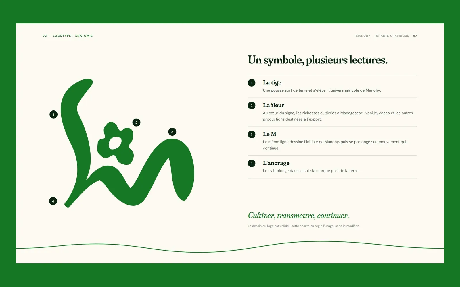
Manohy is a Malagasy verb: to join, to tie, to link end to end; to continue, to carry on, to extend. The guide is built on that double meaning. The symbol reads as four elements — a stem, a flower, the initial M, a root in the ground — and its middle line leaves the M to become a thread: a single continuous line that enters and exits through the edges of every medium. In the guide itself, each page picks up the thread at the height where the previous one left it: laid end to end, the pages form a single stroke.
The guide uses the logo as it was approved, without changing its drawing: it governs its use.
Colours that sort things out
The palette has eight colours, all named in Malagasy: Ala, the forest, the green of the logo; Tsiry, the shoot; Alina, the night; Ronono, the milk. The three harvest colours — Tantely the honey, Tany the earth, Kakao the cocoa — are not decorative: each one codes a supply chain, vanilla, spices or cocoa, and colours the band of its label. Every shade is given in HEX, RGB, Lab, and in CMYK for two papers, coated and uncoated, because a kraft label does not print like a brochure.
Two open typeface families
Fraunces for headings and quotes, Hanken Grotesk for text and tables. Both are under the open SIL licence: usable on every medium, at no cost, on every computer that produces a document. Fraunces has a SOFT axis that rounds its serifs, and the softest setting was chosen: it joins the drawing of the logotype instead of contradicting it.
Marks of origin
The fleuron — the flower of the symbol, on its own —, origin stamps in the spirit of export stamps, and a bilingual traceability label: origin, harvest, lot, net weight, producer. The guide then applies them to stationery, social media, the website, packaging — from the vanilla tube to the stencilled export sack — and a trade-show stand.
Mood images, not a photo shoot
The moodboard photographs are mood images, some of them AI-generated. They set a direction — light, framing, subjects — not Manohy’s reality. The guide lists the twelve images to be produced during a real photo shoot, which will replace them. That is why the pages shown below are those of the guideline work itself, without photographs.
What it changes
Manohy has written, approved rules, and an appendix that says which file to use for which purpose and how to name it. The next printer, the next packaging maker or the next person writing a spec sheet no longer has to guess: the brand holds from one medium to the next without us being in the room.
In pictures
How it looks
-
Three versions of the logo, and the order in which to choose them. 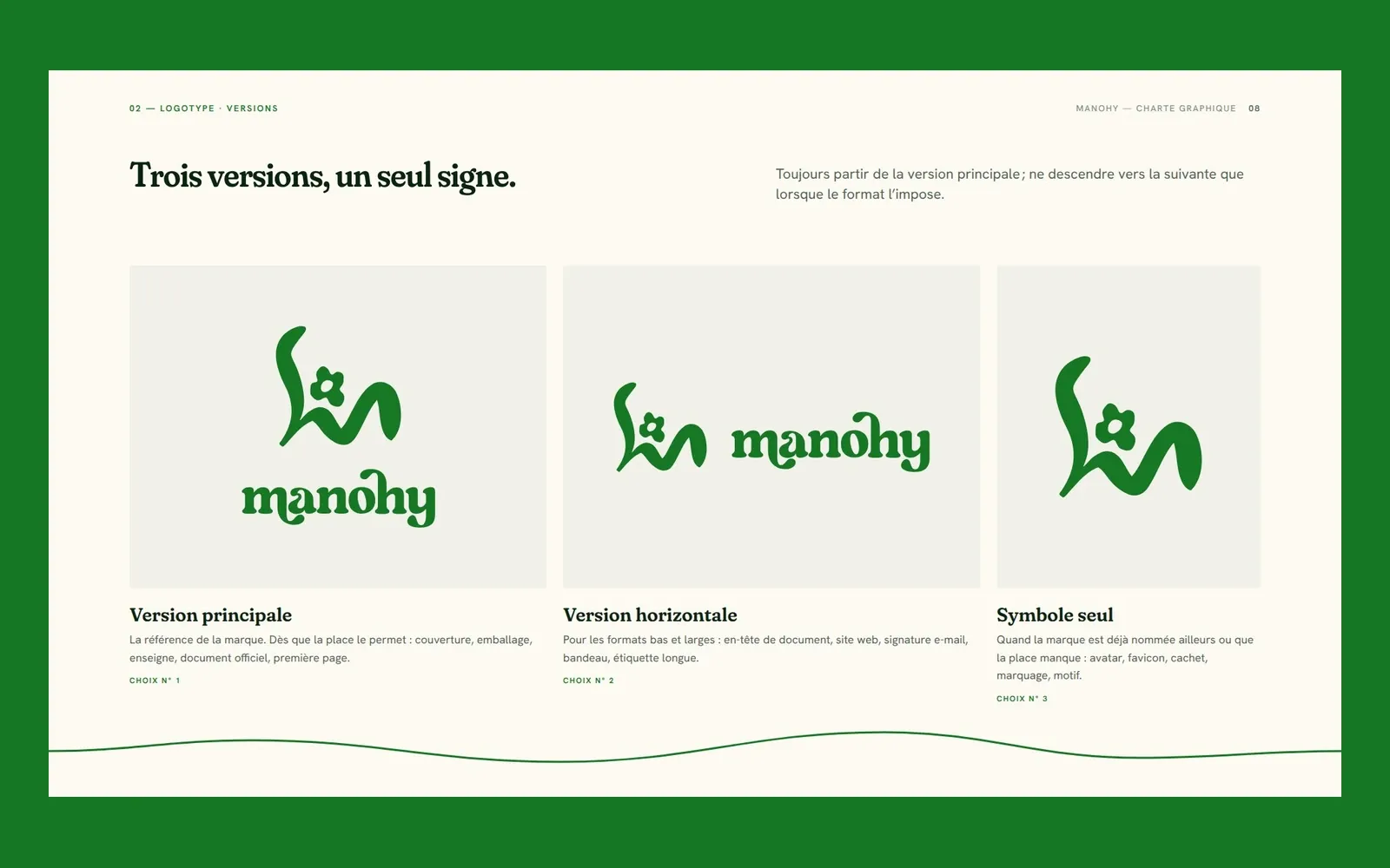
-
Two signature colours, two base colours, three harvest colours and one utility colour. 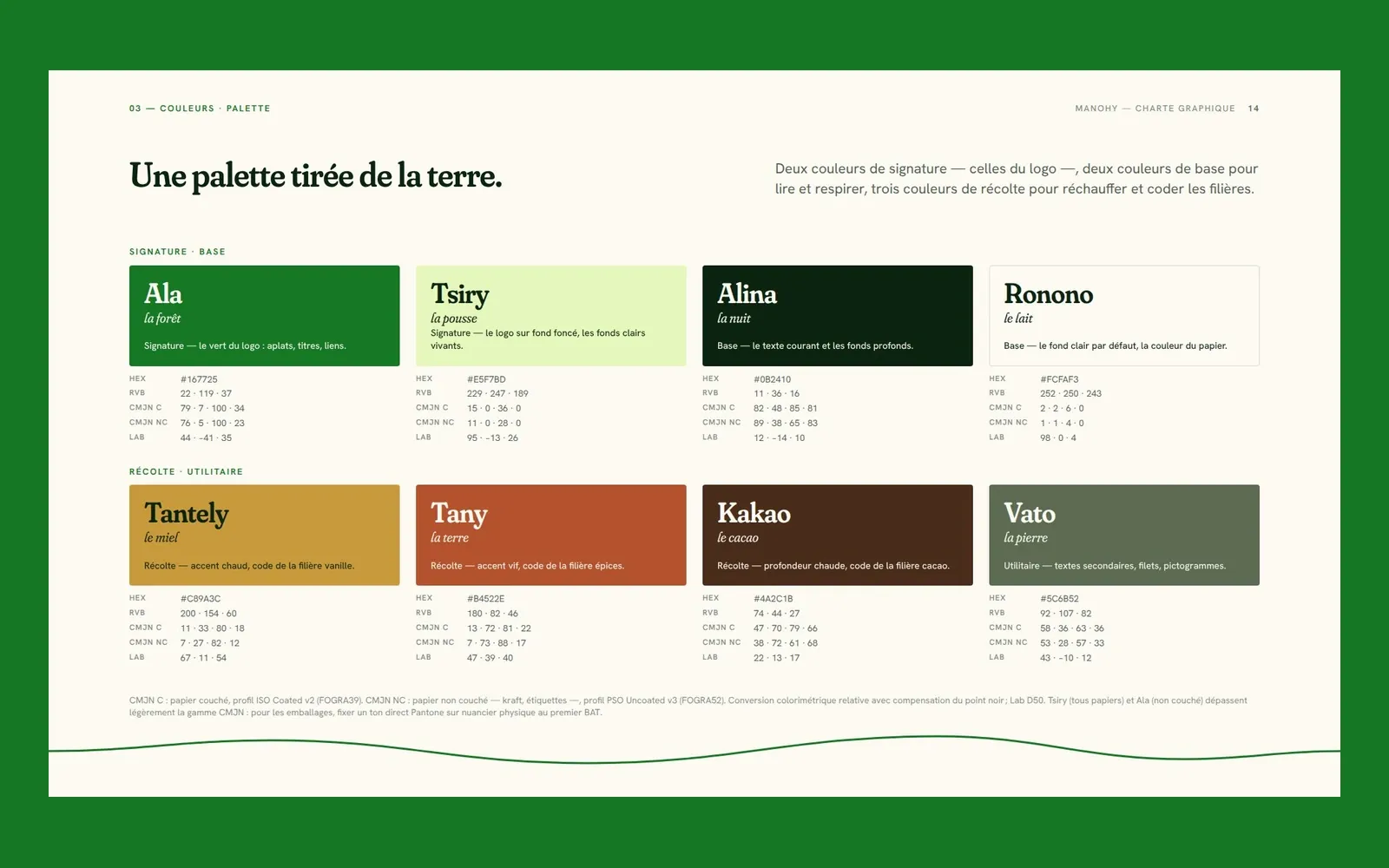
-
Two open-licence families; the SOFT axis brings the headings closer to the logotype. 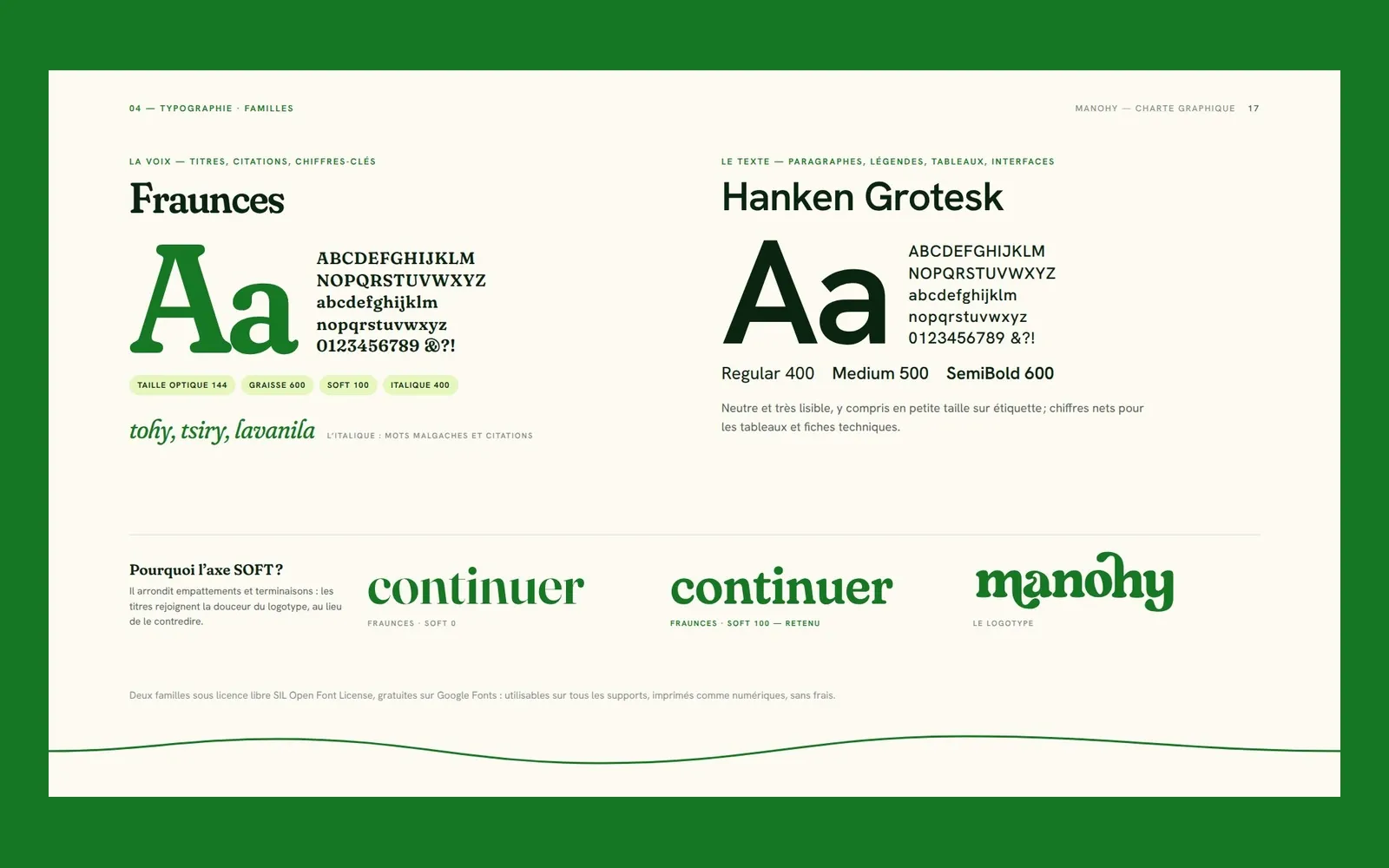
-
Fleuron, origin stamps and traceability label. 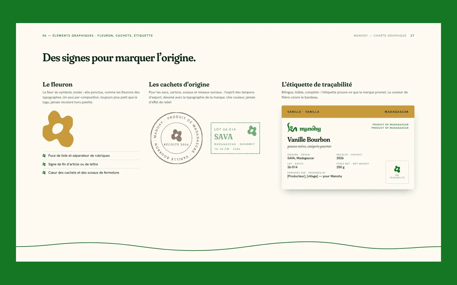
More work
Also worth a look
Cité des Cultures
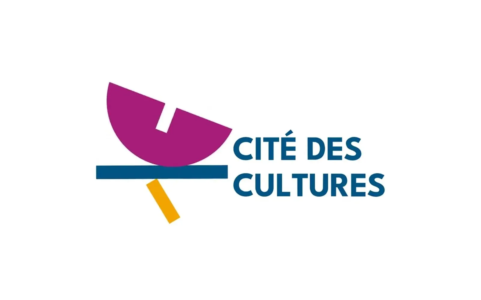
Cité des Cultures – An identity that holds from one show to the next
A cultural centre whose programme changes every month needed one thing that doesn't. We built its identity — a logo, a four-colour palette and a motion sequence — so the place stays recognisable from one exhibition to the next.
Immo Stand
Immo Stand – Reassuring before the first viewing
Choosing a furnished rental requires trust, often before a single viewing. We built a simple, structured identity, led by blue, so the agency's professionalism is visible from the first interaction.
Jeune Patronat de Madagascar
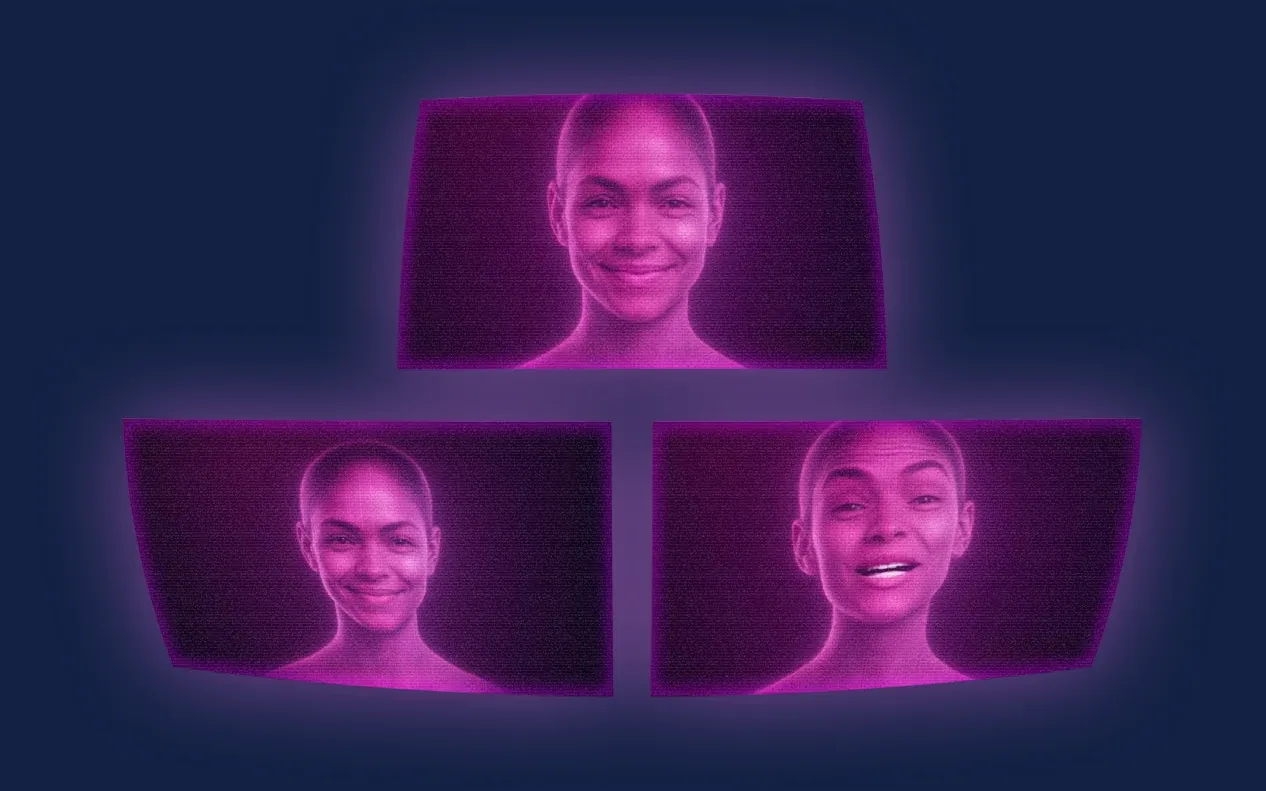
Jeune Patronat de Madagascar – Making a first edition feel like a fixture
The Jeune Patronat de Madagascar was launching its first major entrepreneurs' gathering. In three months Takamoa built the whole thing — identity, content, video, landing page, campaigns — and handed the stage to a host created with artificial intelligence.