Case study
Misaina One logo per division, without losing the brand
A group with several trades has two bad options: a single brand nobody recognises themselves in, or a brand per division in which the group disappears. We built the guidelines that avoid both.
The context
Misaina is organised into divisions — health and technology among others — and presented itself under a single brand.
That situation puts an identity under tension, and there are only two bad ways out of it.
The first is to impose the group brand everywhere. Each division then communicates with codes that are not its own, and eventually works around them: unofficial logos appear, improvised colours, materials made on the side. The guidelines are not followed because they are not usable.
The second is to let each division build its own identity. Every division gains, and the group ceases to exist — nobody makes the connection between two entities that belong to the same house.
What we produced
A complete set of brand guidelines, built around that tension.
A logo that states the trade
The logo is minimal, with a brain worked into the letter “A” — thought, expertise, without having to spell it out. The deep blue carries the rest: trust and professionalism.
A symbol lodged inside a letter rather than set beside it is a decision about durability. It does not come away, it does not disappear at small sizes, and it does not end up used on its own by somebody who found the word too long.
One colour per division, one shape for all
This is the answer to the original problem: the logo varies, the colour changes, the structure holds. Each division gets a shade suited to its field — a light blue for health, where clarity and trust are what you look for; a deep blue for technology, where the subject is innovation.
A division is therefore recognised at first glance, and the group stays legible at the second. Nobody needs to work around the guidelines, because they already allow for what everybody wanted to do.
A palette and two typefaces
Deep blue for stability, orange for vitality. Quicksand for headings, Saira SemiCondensed for body text — one sets the tone, the other gets out of the way, which is exactly its job.
Minimal icons
A set of simple icons completes the system. On materials that explain services, they carry half the understanding without adding a line of text.
What it changes
Misaina has an identity that permits its divisions instead of constraining them.
That is the only kind of guideline that lasts: the one that anticipated the real uses before somebody invented them in a corner.
More work
Also worth a look
Manohy
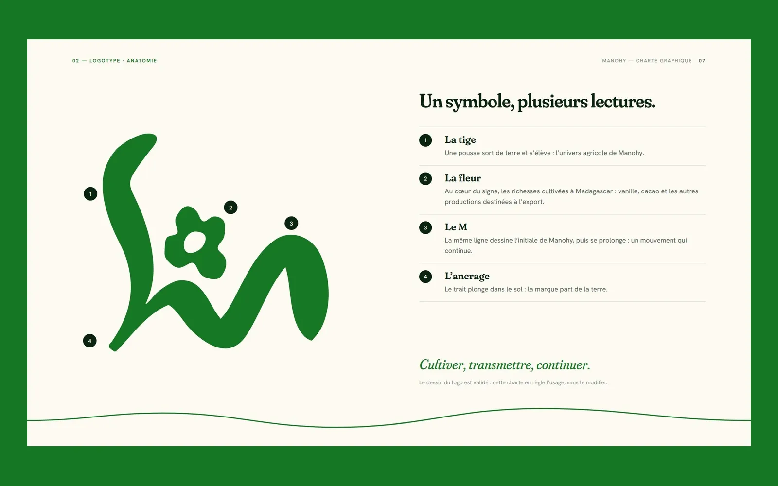
Manohy – A brand guide that ties the land to export
Manohy exports produce grown in Madagascar. We proposed its logo and, once it was approved, wrote the guidelines that govern its use, from the name all the way to the export sack: 36 pages, approved by the client.
Cité des Cultures
Cité des Cultures – An identity that holds from one show to the next
A cultural centre whose programme changes every month needed one thing that doesn't. We built its identity — a logo, a four-colour palette and a motion sequence — so the place stays recognisable from one exhibition to the next.
Immo Stand
Immo Stand – Reassuring before the first viewing
Choosing a furnished rental requires trust, often before a single viewing. We built a simple, structured identity, led by blue, so the agency's professionalism is visible from the first interaction.