Case study
Entasis 3D Saying what a company does at a glance
When the product is visual, the site has to disappear. We gave Entasis 3D a deliberately stripped-back showcase, where nothing competes with the modelling work it came to show.

The context
Entasis 3D does 3D modelling.
It is a trade whose website raises an unusual problem: the product is already an image. A rendering studio that puts a busy showcase online competes with itself — every gradient, every animation, every decorative block takes attention away from the renders, which are the only thing the visitor came to see.
The other difficulty is the one every technical trade shares: a prospect has to understand what the company does and who for before wondering whether the work is any good. A portfolio with no framing lets people admire without giving them a reason to get in touch.
What we produced
A deliberately stripped-back showcase site.
A minimal design, and that is the deliverable
The interface was built by removing rather than adding. Every element was kept because it earned its place — not because it looked nice.
It is a thankless exercise: the result goes unnoticed, and that is exactly the point. On a 3D studio’s site, the best interface is the one you do not remember, because the only thing you remember is the images.
Navigation that asks nothing of you
Visitors reach the essential information without detours. A prospect looking for a supplier opens five sites in five tabs: the one that demands effort loses to the other four.
A presentation that answers the questions in order
Detailed sections explain the company, its values, its services and its history — clearly, and without mixing them up. The order matters: what the company does comes before what it believes.
A way to be contacted
Contact routes are built into the pages where the question actually arises, not only into a dedicated page. A visitor convinced halfway through a portfolio should not have to go hunting for somewhere to write.
What it changes
Entasis 3D has a showcase that puts its work in front and itself behind. That is the right hierarchy for a visual trade, and it is the one most studio sites get the wrong way round.
The result is hard to measure and easy to observe: on this site, what you remember on leaving is the renders.
More work
Also worth a look
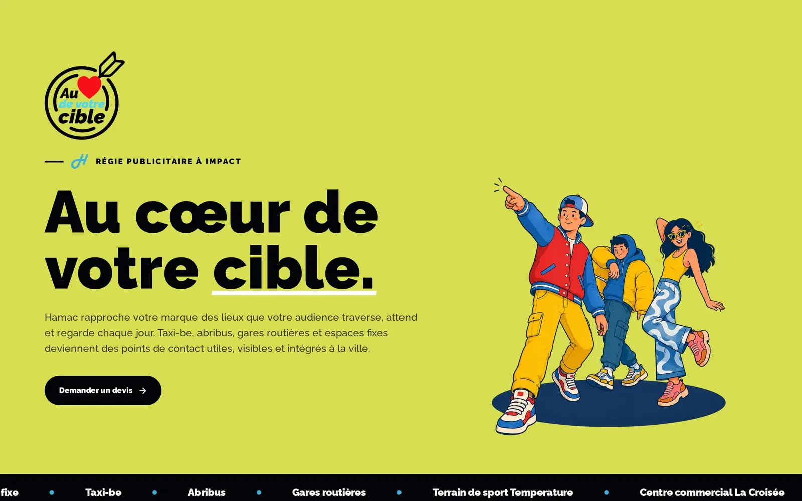
Hamac
Hamac – Selling outdoor advertising to people who live online
An advertising broker whose inventory sits in places rather than on billboards. We built the site that collects already-qualified quote requests — then, month after month, the content that argues for outdoor advertising where the advertisers actually are: online.

Jeune Patronat de Madagascar
Jeune Patronat de Madagascar – Making a first edition feel like a fixture
The Jeune Patronat de Madagascar was launching its first major entrepreneurs' gathering. In three months Takamoa built the whole thing — identity, content, video, landing page, campaigns — and handed the stage to a host created with artificial intelligence.
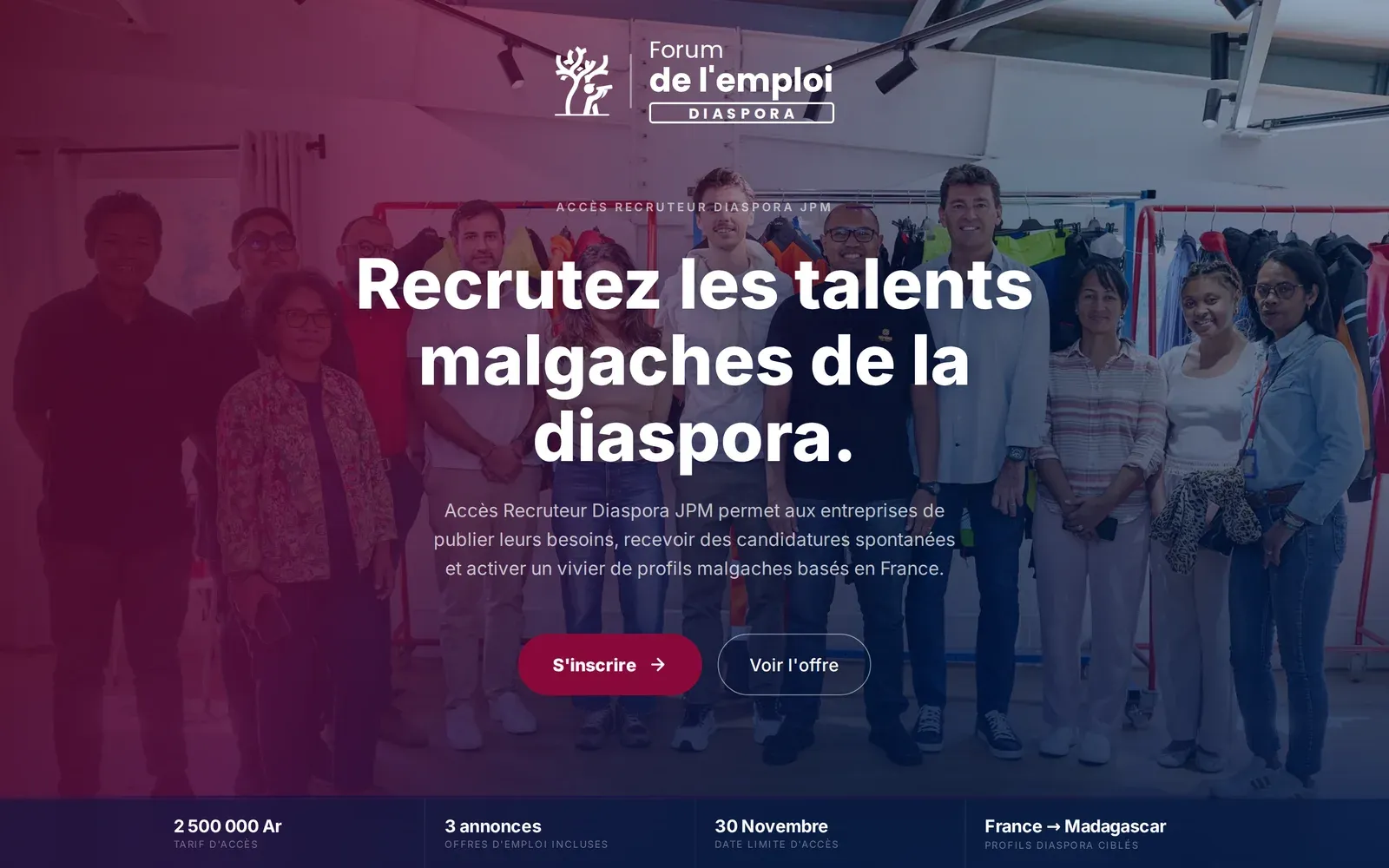
Jeune Patronat de Madagascar
Jeune Patronat de Madagascar – Recruiting at the forum without flying to Paris
The Diaspora job forum brought Malagasy companies and diaspora talent together in Paris for a job-dating event. We built the platform that stretches those two days into five months, and opens them to the companies that could not make the trip.