Case study
CEPD A sister brand that never leaves home
Launching a sister brand raises a simple question that is usually answered badly: how far can it move away without ceasing to belong to the parent? We drew the CRS logo for CEPD, then extended it across every one of its materials.
The context
CEPD was launching CRS, and had to give it an identity.
It is an exercise that looks like a logo commission and is in fact a structural decision. A sister brand has to be recognisable on its own — otherwise it does not exist — while staying attached to the parent — otherwise you have created an internal competitor.
The two mistakes are symmetrical and both expensive. A brand too close to the parent does not stand out: customers read it as a mere product line, and the launch creates nothing. A brand too free detaches itself: the parent funds the reputation of an entity that no longer sends anything back.
What we produced
A logo, and then all of its applications.
The CRS logo, consistent with CEPD
The logo was designed to be unique to CRS and consistent with the CEPD identity. That is the brief word for word, and it is also the whole of the work: finding what has to stay shared — a register, a geometry, a colour family — and what has to differ so that the brand can stand up alone.
Social media visuals
The logo was extended into materials for social media, where a new brand’s daily presence is played out. An identity with no social application is not seen: it is simply absent from the place people would look for it.
Business cards
Cards designed to carry a professional message and stay in the mind of the people who receive them.
For a brand that has just been born, the business card does a particular job: it proves existence. A company nobody has heard of that hands over a well-made card has already answered the first question people were asking without saying it out loud.
Printed materials
Print completes the set for offline communication — the ground where CRS meets the people it deals with without going through a screen.
What it changes
CEPD launched a brand that stands on its own and remains its own. Every piece — screen or paper — carries the same identity, which avoids the commonest fate of sister brands: existing on the guideline sheet, and nowhere else.
More work
Also worth a look
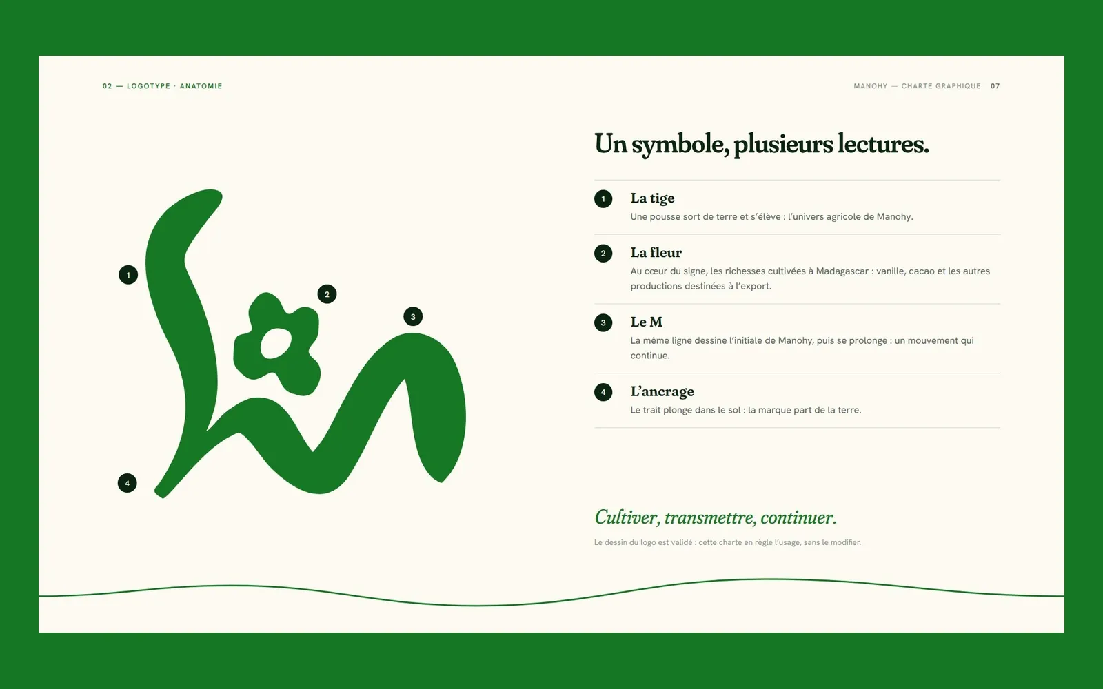
Manohy
Manohy – A brand guide that ties the land to export
Manohy exports produce grown in Madagascar. We proposed its logo and, once it was approved, wrote the guidelines that govern its use, from the name all the way to the export sack: 36 pages, approved by the client.
Cité des Cultures
Cité des Cultures – An identity that holds from one show to the next
A cultural centre whose programme changes every month needed one thing that doesn't. We built its identity — a logo, a four-colour palette and a motion sequence — so the place stays recognisable from one exhibition to the next.
Immo Stand
Immo Stand – Reassuring before the first viewing
Choosing a furnished rental requires trust, often before a single viewing. We built a simple, structured identity, led by blue, so the agency's professionalism is visible from the first interaction.