Case study
Sashinah Setting the elegance of a wellness brand
Sashinah sells matcha, collagen and superfoods with a deliberately restrained voice. Takamoa built its identity, from the monogram to the guidelines, so that the brand's restraint is visible before it is even read.
The context
Sashinah is a wellness brand based in Sofia, selling food supplements across Europe: a ceremonial matcha, several collagens, a plant-based superfood blend.
Its voice is one of restraint. The brand says it wants to do less, but better, and explicitly refuses to pile on promises — which, in a category where almost everyone promises youth and energy, is a position in its own right.
The trouble with a brand that promises little is that it has to show it. Restraint cannot be declared: either it is visible in the form, or nobody believes it.
What we produced
A monogram
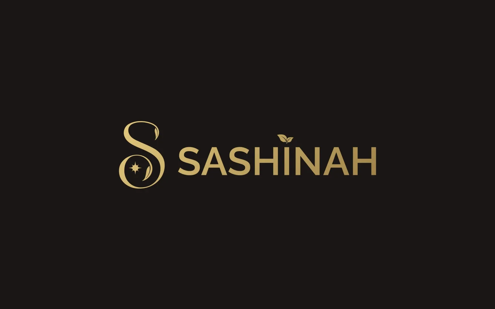
An “S” drawn as one continuous stroke, enclosing a leaf and a star. It works on its own — on a cap, on a seal, on a browser tab — and alongside the name where there is room for it.
The gold is not decorative: it is the palette’s single departure, and it is enough to hold the premium register without the brand having to raise its voice.
Guidelines, and what follows from them
The identity then extends into the brand guidelines, the packaging and the communication materials, under the same rules of proportion and breathing room.
That is where the consistency the brief asked for is actually settled: a range distinguishes itself product by product, but it has to stay recognisable from one to the next. An identity redrawn at every launch loses precisely what it thinks it is gaining.
What it changes
An identity that holds does not get noticed — that is its job. It is measured another way: by the fact that a new product can ship without reopening the argument over the colour, the placement of the monogram or the size of the name.
More work
Also worth a look
Manohy
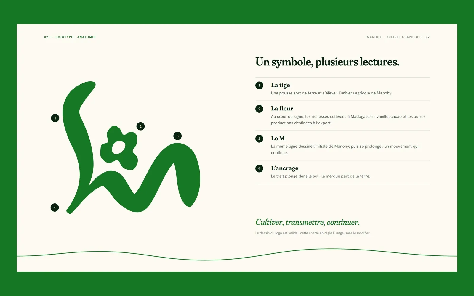
Manohy – A brand guide that ties the land to export
Manohy exports produce grown in Madagascar. We proposed its logo and, once it was approved, wrote the guidelines that govern its use, from the name all the way to the export sack: 36 pages, approved by the client.
Cité des Cultures
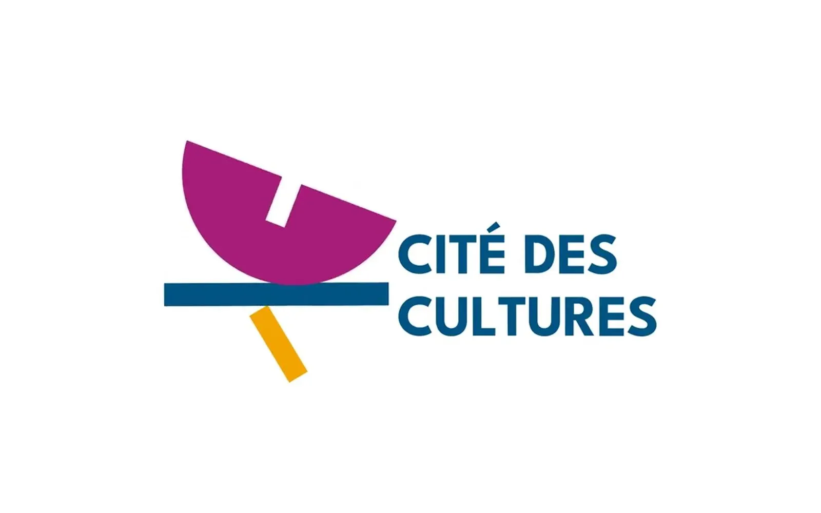
Cité des Cultures – An identity that holds from one show to the next
A cultural centre whose programme changes every month needed one thing that doesn't. We built its identity — a logo, a four-colour palette and a motion sequence — so the place stays recognisable from one exhibition to the next.

Immo Stand
Immo Stand – Reassuring before the first viewing
Choosing a furnished rental requires trust, often before a single viewing. We built a simple, structured identity, led by blue, so the agency's professionalism is visible from the first interaction.