Case study
MP Madagascar A logo, and what it takes to use it
A logo delivered on its own changes nothing: it stays in a folder because nobody knows what to do with it. We delivered MP Madagascar's together with the visuals that put it into circulation.
The context
MP Madagascar needed a logo.
That request almost always conceals another one. A company commissioning a logo does not want a file: it wants to be recognised. But a logo makes nobody recognisable — repetition does, and repetition needs material to appear on.
Hence the ordinary fate of logos delivered alone. They arrive in a zip file, with their variants and their formats, and there they stay. With nothing to do with them, people set them as a profile picture and go on publishing visuals that look nothing like them.
What we produced
A bespoke logo, and the content that puts it into circulation.
The logo
A distinctive, striking logo, designed to embody MP Madagascar’s identity and values. Modern and versatile — meaning built to behave properly everywhere, not only to look good on the presentation board.
Versatility is the real quality criterion here. A logo that exists in one version only, on one background, at one size, is a logo the first person who needs it elsewhere will distort.
The content that makes it exist
A set of visuals was developed for the digital presence: work designed to catch attention, with a look that holds from one post to the next.
That is the part that turns a logo into a brand. Recognition does not come from the symbol, it comes from seeing it again — and you only see it again if somebody regularly produces content carrying it.
What it changes
MP Madagascar does not merely have an identity: it has the means to show it, from the day of delivery, without commissioning a second project to make the first one useful.
That is the difference between a logo and a brand image. The first is delivered once; the second begins the day you publish.
More work
Also worth a look
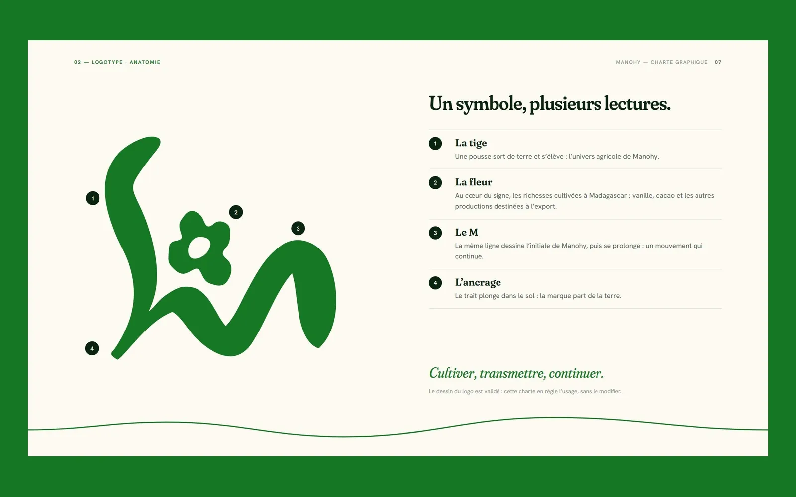
Manohy
Manohy – A brand guide that ties the land to export
Manohy exports produce grown in Madagascar. We proposed its logo and, once it was approved, wrote the guidelines that govern its use, from the name all the way to the export sack: 36 pages, approved by the client.
Cité des Cultures
Cité des Cultures – An identity that holds from one show to the next
A cultural centre whose programme changes every month needed one thing that doesn't. We built its identity — a logo, a four-colour palette and a motion sequence — so the place stays recognisable from one exhibition to the next.
Immo Stand
Immo Stand – Reassuring before the first viewing
Choosing a furnished rental requires trust, often before a single viewing. We built a simple, structured identity, led by blue, so the agency's professionalism is visible from the first interaction.